How to Cut Revision Rounds on Custom Orders (Without Sounding Pushy)
A merchant-focused guide to reducing revision rounds on custom orders by tightening briefs, structuring feedback, and automating the chase without making customers feel rushed.
How to Cut Revision Rounds on Custom Orders (Without Sounding Pushy)
Why this is worth solving
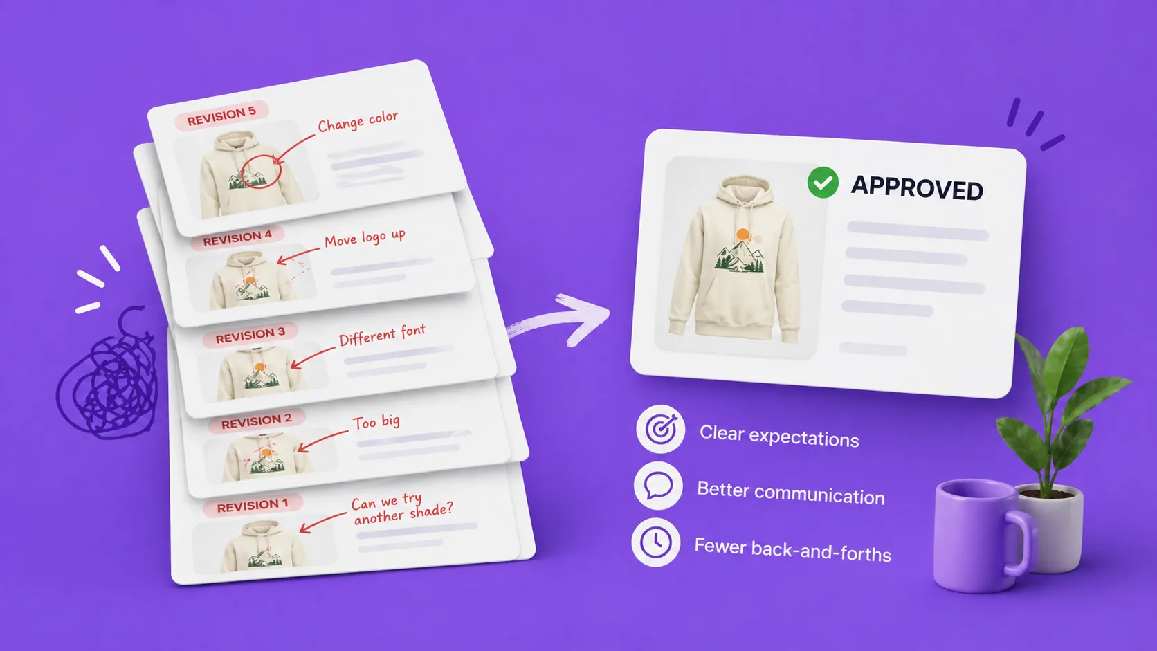
Most custom-order shops do not lose money on the design itself. They lose it on the third, fourth, and fifth revision. Each round is another export, another email, another two days of waiting, and another chance for the customer to change their mind on something they had already approved. The shipping deadline does not move, so the margin gets eaten one revision at a time.
The instinctive fix is to push harder: more frequent reminders, firmer language, asking the customer to "please confirm by end of day." That works once and damages the relationship for the next order. The better fix is structural. You change how the proof goes out, how feedback comes back, and what the system does when the customer goes quiet, so the same order naturally closes in two rounds instead of five. The customer never feels chased. Your team gets the design out the door.
Here is how to do it.
Where the extra rounds actually come from
Before fixing it, name it. Most "extra" revisions trace back to one of five causes:
- A vague brief. The order came in with "make it pretty" energy. The first proof is a guess. The second is a guess at the customer's reaction to the guess.
- Vague feedback. The customer says "a bit warmer" or "make it pop." The designer interprets. The interpretation is wrong. Round three.
- Drip-fed feedback. The customer approves, then a day later remembers a tweak. Then their partner sees it and remembers another. Each remembered tweak is its own round.
- No way to show what they mean. They want it to look like a thing they saw, but they cannot describe it, so they describe it badly.
- Stalls that get treated as silence. The customer forgot. You assume disinterest. You re-send. They feel chased. They reply with new changes that are really stalling tactics for a decision they did not want to make.
Every fix below targets one of those five.
Tighten the brief at checkout, not after
The cheapest revision round is the one that never happens because the first proof was already close. That starts on the product page.
Use Shopify line item properties to ask the questions you know your designer will need answered: exact spelling of names, dates, dimensions, color preferences, examples they like. If you are selling a custom pet portrait, ask for three reference photos and a preferred background color. If you are selling wedding stationery, capture the names, date, venue, and a font preference. If you sell custom signs, ask for the exact wording, the medium it is going on, and the room it is for.
This sounds like a marketing exercise but it is actually a revision-reduction exercise. Every question you ask at checkout is a guess your designer does not have to make later. Two well-placed product-page questions usually save a full round of revisions per order.
A good test: if your designer's first email back to the customer ever says "before I start, can you tell me…", that question belongs on the product page.
Make the first proof high-confidence, not first-draft
There is a temptation to send the first proof fast to look responsive. Resist it. A fast, rough first proof invites broad feedback ("hmm, not quite what I had in mind") that resets the brief. A slower, more confident first proof invites narrow feedback ("can the date be a bit larger") that closes in one round.
Concrete things that raise first-proof confidence:
- Pull the customer's exact wording from the order, do not paraphrase it.
- Match the style they referenced, do not improvise.
- If you have multiple defensible directions, present two or three on the same page, not one at a time.
- If a real constraint forces a choice (a name will not fit on one line at the requested size), call it out next to the proof so they are not surprised.
You are not aiming to nail it on round one. You are aiming for round-one feedback to be a list of small adjustments, not a pivot.
Ask for specific feedback, not "thoughts?"
The wording of your proof email matters more than you think. "Let me know what you think" produces vague feedback. "Please approve, or list any changes you would like" produces a list.
Two phrasing tweaks save rounds:
- Replace open-ended questions with explicit choices. Ask the customer to either click approve or write changes in one place. Do not ask "any thoughts?" because that invites tone, not changes.
- Ask for everything in one go. The single most expensive sentence in custom-order communication is "anything else?" after a customer has already given feedback. It explicitly invites a second batch. Instead, frame the request as "send all your changes at once, and we will revise from there." That sets the expectation that drip-feeding is not the norm.
You are not being demanding. You are being clear about what kind of response is useful.
Let customers attach files with their feedback
The single biggest cause of "interpretation" revisions is customers not being able to show what they mean. Words like "warmer," "more elegant," and "cleaner" mean different things to different people. A reference image, a screenshot of a thing they saw, or a marked-up version of your proof closes that gap immediately.
Make file uploads part of the feedback step, not a separate email. If the customer can attach an image or PDF in the same place they leave their comment, you stop getting "more like the one I sent you the other day, you know the one" replies and start getting "more like this attached photo" replies. One round of "here, like this" usually replaces two or three rounds of "still not quite right."
Cap drip-fed changes by structuring revisions
If you are getting two rounds of feedback for what should be one set of changes, the workflow is rewarding the drip. Two structural fixes:
- Treat each revision upload as a fresh, complete pass. When you upload revision 2, you are saying "here is everything you asked for." If the customer comes back with "oh, one more thing," you have a clear, polite framing: "happy to add it, that will be revision 3." Customers who see a counter usually batch their next set of changes rather than send single-point edits.
- Show revision history. When the customer can see "revision 1 approved by you on Tuesday, revision 2 sent Thursday," they understand they are inside a process, not a chat. That visible structure quietly discourages reopening earlier decisions.
Neither of those involves saying no. They involve making the shape of the work visible.
Automate reminders so you do not have to be the bad guy
The customer who has gone quiet for four days is almost never refusing to approve. They forgot. They are on holiday. The proof email is buried under an Amazon receipt. The job your reminders do is helpful, not pushy, but the way they get sent matters.
Two principles:
- Let the system send them, not you. Automated, polite, identical reminders feel like a system. The same message typed by you twice in three days feels like nagging. The content can be identical; the source changes how it lands.
- Cap the cadence. Two or three reminders, spaced two or three days apart, close most stalled approvals. After four sends, the customer who was going to act has acted, and more emails are noise.
Done this way, "the chase" stops being a thing your team does and starts being a thing the workflow does. Your designer never has to write the awkward "just bumping this up" email.
Use a transparent auto-approval policy, not pressure
Auto-approval sounds aggressive until you frame it correctly. Stated up front, on the product page and in the proof email, it is just a deadline. "If we do not hear back within five days, we will proceed with this design as approved so your order ships on time." Customers respect that. It is the same logic as any other order-cutoff policy.
Used quietly without warning, it is a trap. The difference is the framing.
A few practical rules:
- State the window in plain language at three points: the product page, the proof email, and the approval page itself.
- Pick a window that matches the product. Three to five days is fine for low-touch items. Use longer windows or turn it off entirely for high-stakes work like wedding stationery or large prints.
- Prefer reminders before the deadline, not pressure phrases at the deadline. "Auto-approval in 24 hours" is a fact. "We need an answer right now" is pushy. Same outcome, different feel.
Auto-approval is not a way to make customers move faster. It is a way to keep an order moving when a customer has already mentally moved on.
Give the customer an undo, so they stop hedging
A surprising amount of revision-round inflation comes from customers being afraid to commit. They send "one more small change" because clicking approve feels final.
Give them a short revert window after approval (something like 24 to 72 hours) where they can change their mind. Two things happen:
- Customers click approve sooner, because the decision is reversible.
- The revert almost never gets used. The option is the value, not the action.
This is the polite version of the deadline. You are not chasing a yes; you are lowering the stakes of giving one.
A worked example
Say you sell custom-engraved cutting boards. Your old flow looked like this: order in, designer drafts a layout, email goes out with a JPG attached, customer says "looks great but can we try a different font?", designer revises, customer says "actually can you also center it?", designer revises, customer's spouse weighs in, designer revises, by round four you are losing money on a $90 order.
The revised flow looks like this:
- Product page asks for exact wording, font preference (three options pictured), and the recipient's name. Three line item properties, captured at checkout.
- Designer pulls the wording verbatim into the chosen font template. First proof goes to a per-order approval page with two centered alternatives at the requested size.
- Customer receives an email: "Approve your design, or send any changes you would like in one go." They can comment and attach a reference photo on the page itself.
- They request a slightly larger name and pick alternative B.
- Revision 2 is uploaded to the same page. Customer is automatically emailed.
- They approve. A 24-hour revert window appears in case they change their mind. They do not use it.
- Order tag flips to approved. Production cuts the board.
Two rounds. No chase. No pushy emails. Same customer, better experience, and the order ships on the original promise date.
Where ApprovePro fits
ApprovePro is built so this whole flow runs without manual coordination. Each Shopify order gets its own approval page tied to the order ID, and revisions increment automatically every time a designer uploads a new version. The customer is emailed the link the moment the proof is ready, with a clear approve-or-request-changes choice on the page itself. Revision history is visible by default, so a customer can see which version they are looking at and what they have already approved.
Customer file upload sits next to the comment box, so feedback like "match this reference" arrives with the reference attached. That alone collapses a meaningful number of "still not quite right" rounds.
The chase is handled by settings, not by you. You can pick an auto-approval interval so a proof closes itself when a customer goes quiet, schedule customer reminders on a cadence you choose, and turn on recurring reminders (capped at four sends, never past 28 days) so they don't become spam. The optional revert window lets customers change their mind inside a defined period, which makes the initial approval click feel less final and quietly cuts down on hedging.
For multi-file proofs, you can configure whether the customer approves all files as one decision, picks a single preferred design, or approves each file individually, with a per-order override for the unusual case. None of that takes manual chasing to enforce.
The point of the whole product is to do the unglamorous coordination work that revision rounds feed on, so the relationship with the customer can stay friendly and the order can still ship on time.
Final takeaway
You do not cut revision rounds by pushing harder. You cut them by making the brief specific, the first proof confident, the feedback structured, the file uploads inline, the reminders automatic, and the auto-approval transparent. None of those feel pushy to a customer because none of them are about pressure. They are about removing the ambiguity that creates extra rounds in the first place.
If you want to run this kind of workflow without rebuilding your tooling, see how ApprovePro handles design approvals on a single page per Shopify order.